Brochures for Dutch Designers
Bringing Dutch Design to life with a brochure that tells a story.
Project Role
Graphic Designer
Tool
Adobe InDesign, Photoshop
Timeline
Q4 2021
Industry
Editorial & Print Design
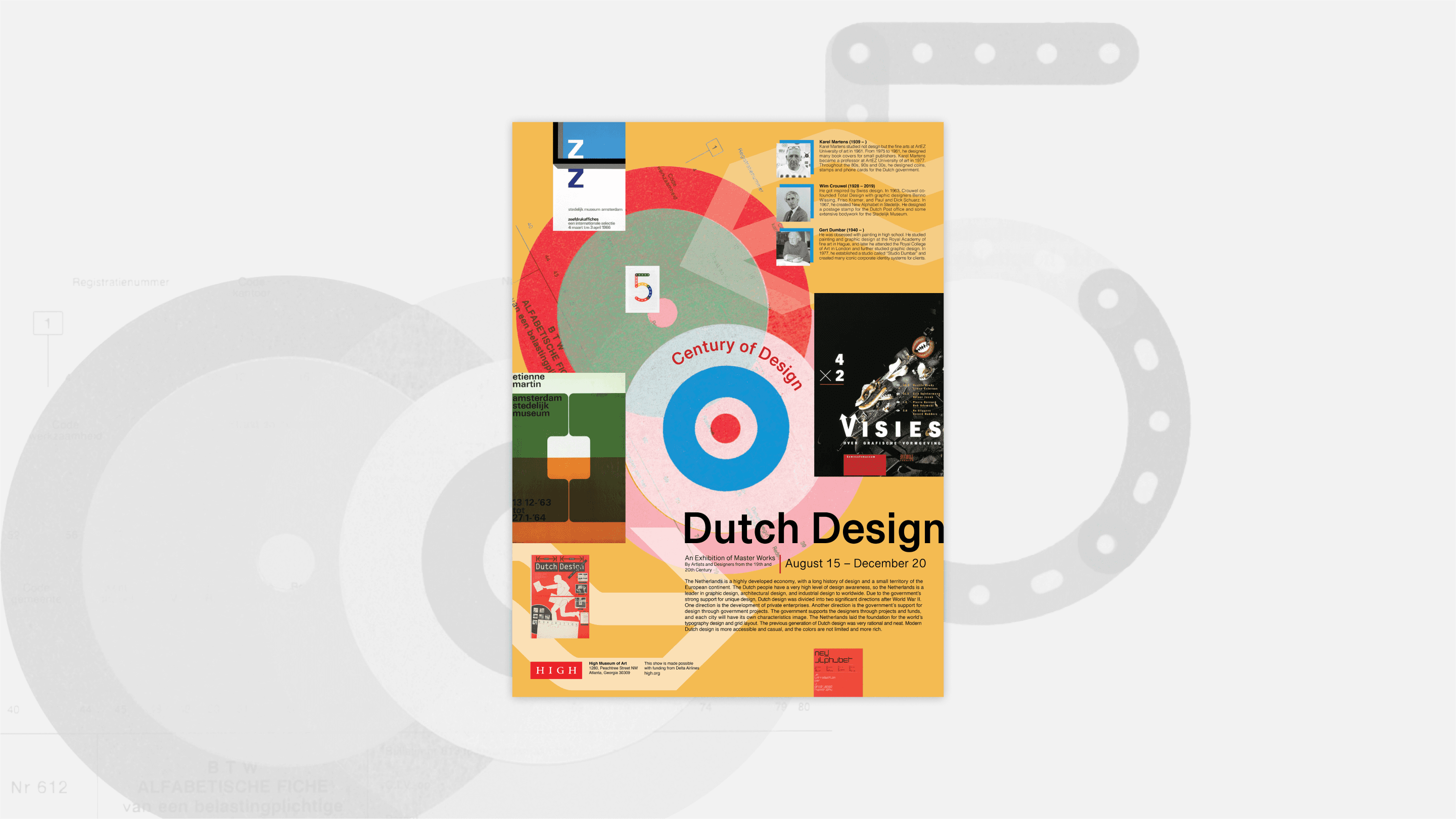
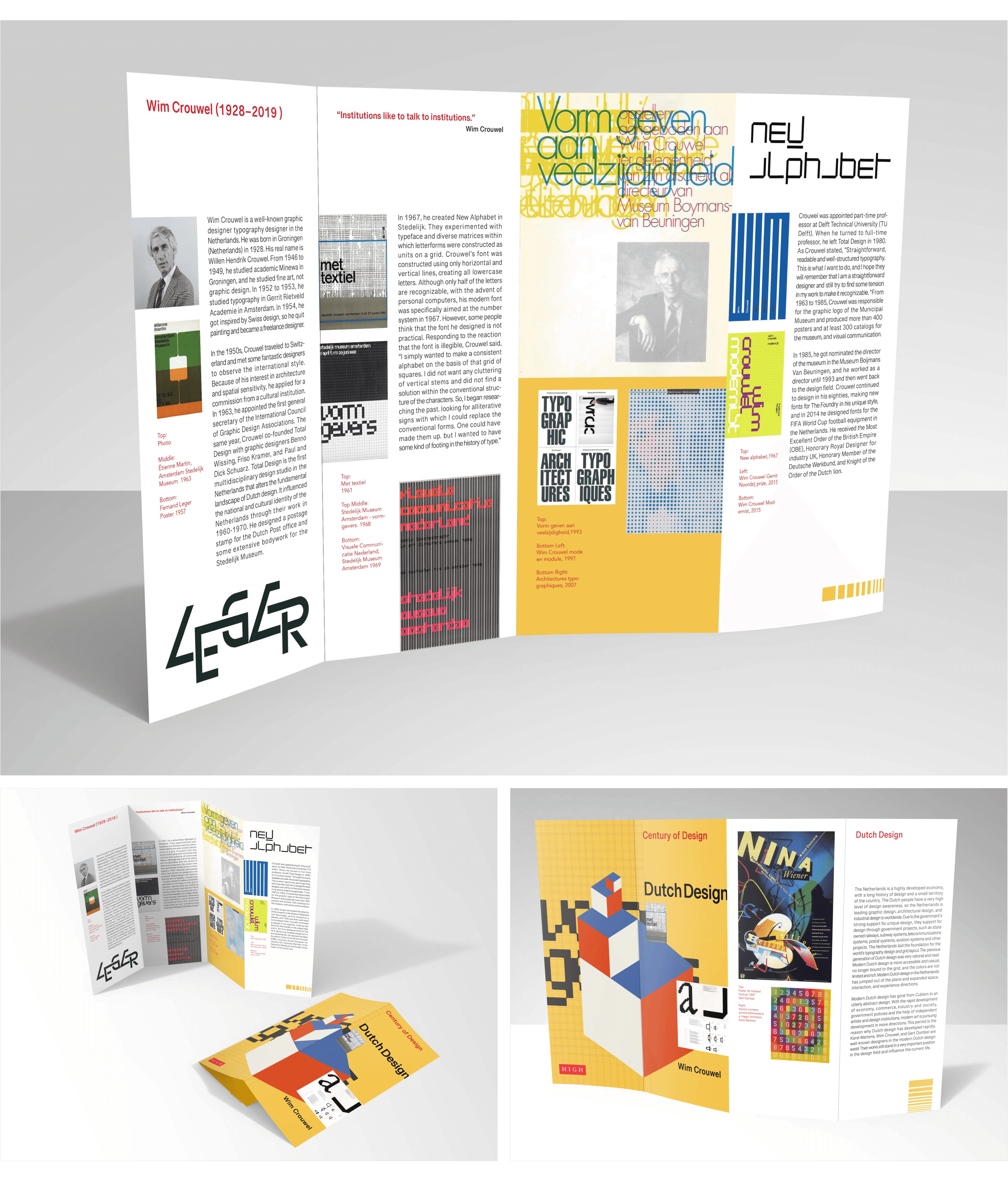
Step into the world of Dutch design with three talented graphic designers. Each brochure highlights their innovative work, blending tradition with modernity. From captivating typography to mesmerizing layouts, explore their unique perspectives and creative prowess. The brochure for Wim Crouwel, one of the designs in this series, won bronze in the International Design Awards (IDA) in 2021. Special thanks to Professor Peter Wong from Savannah College of Art and Design who taught me the fundamental knowledge of layout design and InDesign skills.

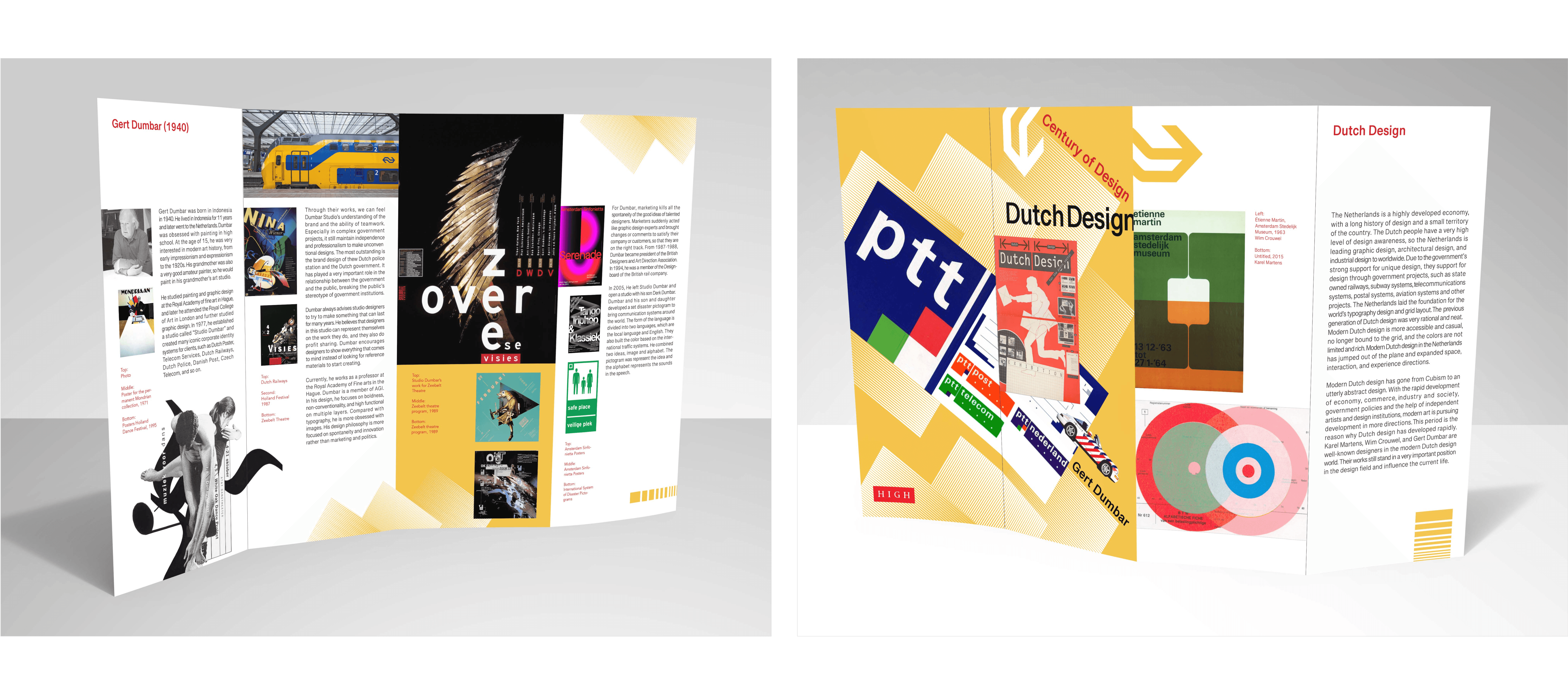
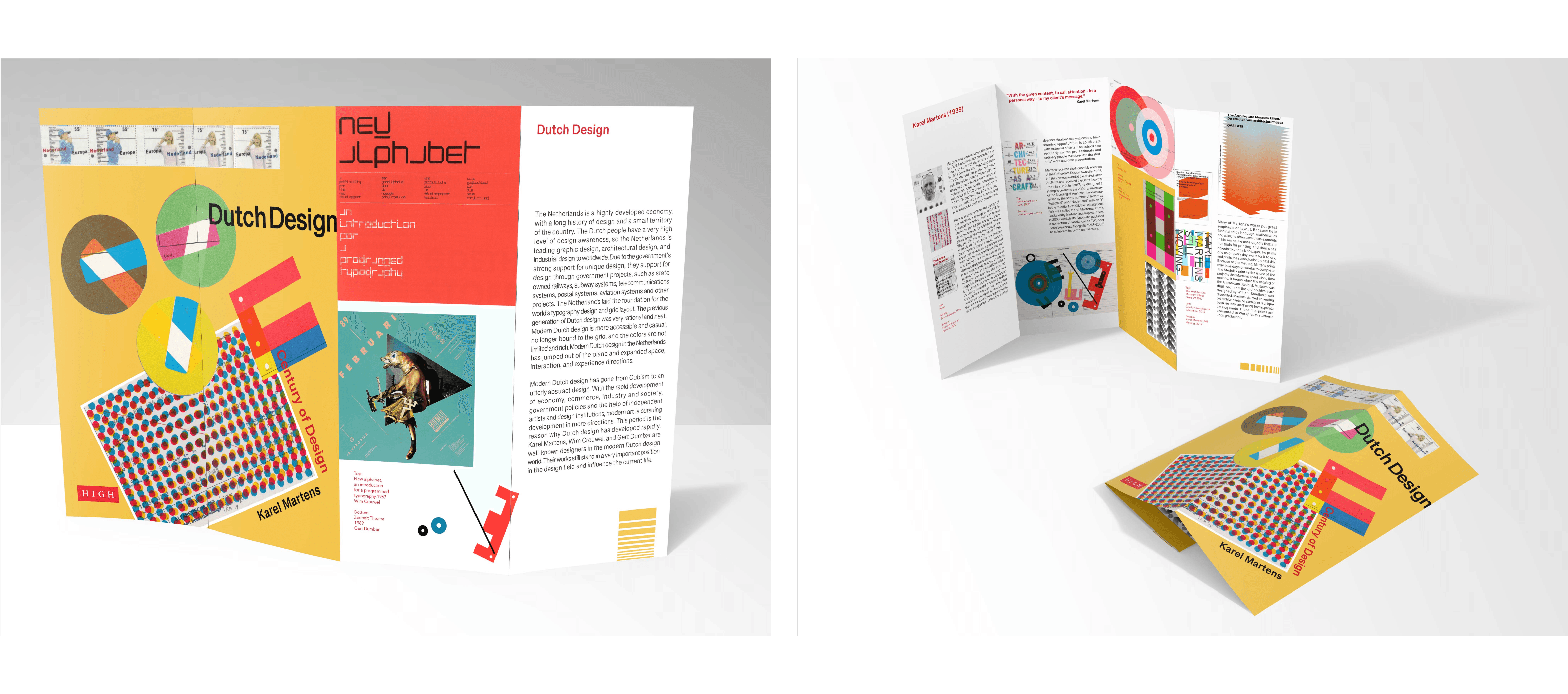
Koyu designed a brochure series introducing Dutch Designers Karel Martins, Wim Crouwel, and Gert Dumbar and their career. She aimed to develop a visually appealing brochure for each Dutch designer, with their design principles and unique features.
Responsibilities
Researched prominent graphic designers from the Netherlands to gather inspiration and insights into their distinctive styles and design philosophies.
Developed a clean and visually appealing layout for the brochure in InDesign to ensure optimal readability and aesthetic appeal.
Conceptualized and finalized brochure branding, aligning it with Dutch design principles and the individual styles of each featured graphic designer.
Team size
One-person project
Wim Crouwel
Designed using Adobe InDesign, the brochure maintains a meticulous balance of text and imagery, ensuring seamless alignment throughout. Every photo and piece of text is precisely positioned to create a visually harmonious layout, while the labels for each art piece are clear and highly readable, enhancing both accessibility and aesthetic appeal.
Gert Dumbar
Karel Martins
Dutch design, shaped by De Stijl and the Amsterdam School, embraced bold colors, geometric shapes, and clean lines. This influence is reflected in Koyu's design, which has a clear and balanced layout, strong visual contrast, and easy-to-read typography, capturing the essence of modern Dutch aesthetics.
50+ sketches
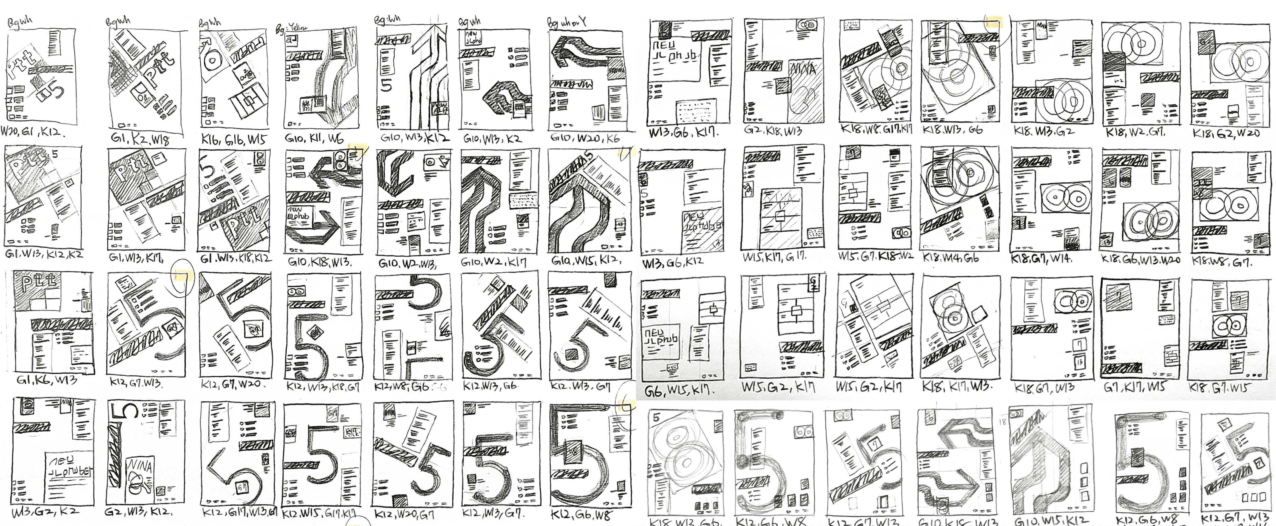
Emphasize with Contrast
Each of the three designers' work were rich in colour and looked great when viewed as individual pieces. However, when multiple pieces were placed together, it quickly became overwhelming to the eye. In order to balance the different works in a single brochure, it was important to contrast the different complexities of each design, such as loudness and silence, so that each piece could stand out on its own.